Make product truth the center of the workflow
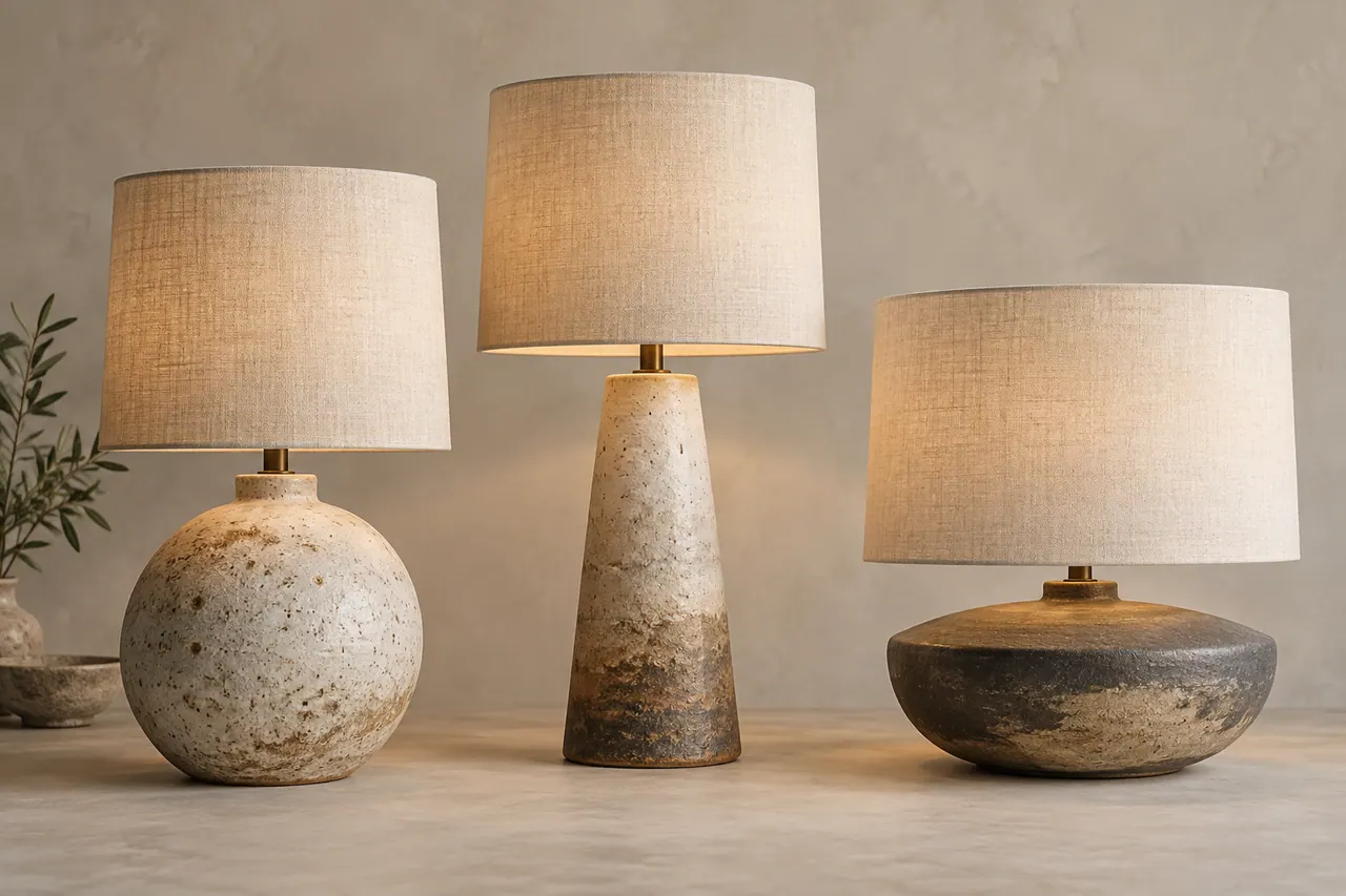
An ecommerce photograph has two jobs that sometimes pull in different directions. It must attract attention, and it must describe what a customer will actually receive. AI editing can help with backgrounds, cleanup, and presentation, but the product itself remains the evidence. This PicWish AI guide develops a photography workflow for a fictional collection of handmade table lamps called Stillroom. The collection contains three ceramic bases with linen shades, each with small surface variations that are part of the objects rather than defects to erase.
The example is a planning exercise, not a claim that these lamps exist or that the workflow has produced measured sales results. In a real project, replace the fictional product details with verified information from the maker. The central principle remains the same: preserve the lamp's shape, color, materials, proportions, hardware, and included components. An appealing generated room cannot compensate for a photograph that misrepresents the item being sold.
PicWish presents photo editing tools including background removal and image enhancement, along with AI-assisted design options. Those broad capabilities can support an ecommerce workflow, but the precise interface and available controls may change. This article explains the decisions to make at each stage rather than assuming every account has identical features. Where a particular correction is unavailable, use an appropriate external editor or return to the source photograph.
The finished listing package will contain a clean primary image, a scale view, a material detail, an illuminated view, a carefully labeled lifestyle composition, and a dimension graphic. Each image answers a different customer question. The goal is not to generate as many attractive scenes as possible. It is to build a compact set of images that makes the product understandable and reduces the need for customers to guess.
Define the collection before planning the photographs
Stillroom's fictional collection contains the Pebble, Column, and Low Bowl lamps. Pebble has a rounded ceramic base with a small offset neck. Column has a taller, nearly cylindrical base with a subtle taper. Low Bowl has a broad shallow body and a short central stem. All three use plain linen shades, but their proportions differ. These distinctions should remain visible throughout the image set rather than being softened into one generic lamp shape.
Create a product record for each item. Record dimensions, shade shape, cord color, switch position, finish, and what is included in the purchase. If the collection uses handmade ceramic glazes, document whether variation is expected across units or whether each photograph represents a specific one-of-a-kind item. That choice affects how the images should be labeled and how closely a customer can expect their lamp to match a pictured surface.
Separate verified facts from visual preferences. A base height is a fact supplied by measurement. A desire for a calm bedroom atmosphere is a creative preference. An included bulb is a fact that the maker must confirm. A warm pool of light is a visual treatment that must still agree with the actual lamp and bulb configuration being represented. Keeping these categories separate prevents mood-board decisions from quietly becoming product claims.
Write down the questions customers are likely to ask. How large is the lamp? What does the glaze look like? Where is the switch? How does it look when lit? Does the cord show? The image plan should answer these questions in a deliberate order. This makes the shoot more efficient because every photograph has a reason to exist and every edit can be judged against that reason.
Distinguish catalog images from lifestyle concepts
The primary catalog image should provide a clear view of the actual product with minimal distraction. For Stillroom, that means a three-quarter view showing the base, shade, and enough cord to represent the item honestly where relevant. The background can be simplified or replaced, but the lamp itself should remain grounded in a real source photograph. This is the image customers use to understand the object before imagining it in their own space.
A lifestyle image serves a different purpose. It suggests how the lamp might fit on a bedside table, shelf, or reading corner. If the setting is generated, treat it as a styled composition rather than documentary proof of a real installation. Keep the product accurate and avoid adding accessories that appear to be included. Where the presentation could otherwise mislead, label the scene appropriately in the listing or caption.
Concept images belong in a third category. A maker may use AI generation to explore future glaze colors or hypothetical room arrangements. Those explorations can be useful internally, but they should not appear in an active product listing as though the depicted item is available. Keep concept files separate from approved sales images. A visually convincing mockup is still a proposal until the real product exists and has been verified.
This separation makes review easier. The catalog image is judged for accuracy and clarity. The lifestyle image is judged for accurate product placement and helpful context. The concept image is judged for creative usefulness. Mixing the categories encourages the wrong standard, such as approving a misleading catalog image because it looks emotionally appealing or rejecting an exploratory concept because it is not yet physically manufactured.
Build a source photography setup you can repeat
A repeatable source setup is more valuable than a complicated one. Place the lamp on a stable surface, use a neutral backdrop, and choose soft light that reveals the ceramic form without producing harsh glare. Keep the camera position marked so that the three models can be photographed from comparable angles. Consistency makes later editing and side-by-side comparison much easier.
Use the camera or phone's available controls to avoid unnecessary changes between shots. If exposure or white balance shifts automatically whenever you move a lamp, the collection may acquire inconsistent colors before any AI editing begins. A simple reference photograph of a neutral target under the same light can help you assess later corrections. The exact capture method depends on your equipment, but the intention is to preserve a stable visual baseline.
Clean temporary dust and fingerprints from the product before shooting. Do not polish away intentional patina or alter the finish for the photograph. Physical preparation can prevent hours of digital cleanup while keeping the image faithful to the actual object. Check the shade seam, cord arrangement, and switch position as well. A twisted cord or crooked shade can distract from the product and may be harder to correct convincingly afterward.
Take a few wider frames around each planned crop. Extra space gives you flexibility for different listing layouts and avoids cutting off the shade or cord too tightly. Keep the original files intact. Any processed image should be traceable to its source so that a reviewer can compare the edited result with the real photograph rather than relying on memory.
Capture the lamp's structure before its atmosphere
Begin with the lamp unlit. This makes it easier to evaluate the base color, shade fabric, and overall silhouette without a bright bulb influencing exposure. Photograph a front view, a three-quarter view, and a side view if the shape changes meaningfully across angles. The three-quarter view will often serve as the primary image, while the others provide reference for checking later edits.
Pay attention to the connection between the base and shade. A narrow stem, socket, or support can disappear against a similar background. Choose enough separation that the actual construction remains visible. If an AI cutout later removes this area, you will have a clear source showing what should be restored. Product photography benefits from these unglamorous reference views because they prevent attractive but structurally wrong results.
Photograph the cord and switch deliberately. You do not need every image to emphasize them, but the listing should not imply that a corded lamp is cordless. Arrange the cord neatly without hiding its existence in all views. If the switch is on the cord, capture a useful detail. If the product has different electrical versions, use the correct source for the version being listed rather than assuming the difference is too small to matter.
Only after the structure is documented should you make the moodier illuminated photographs. The unlit set provides a stable reference against which those images can be checked. Without it, a warm glowing scene can make it difficult to tell whether the glaze is truly cream, the shade is off-white, or the room lighting is simply tinting everything in the frame.
Remove backgrounds without erasing the product
Background removal is a starting operation, not a final quality judgment. A lamp has several areas that deserve careful attention: the outer shade edge, the thin stem, small gaps beneath the shade, the cord, and any translucent fabric boundary. Inspect the cutout on a contrasting temporary background so that missing regions and halos become visible. A mask that looks acceptable on white may fail on a darker lifestyle scene.
Do not let the tool treat a pale cord as part of the background. Likewise, a shadowed gap between base and shade should remain a gap, while a dark support inside that gap should remain part of the product. These distinctions can be subtle. Compare directly with the source photograph rather than deciding from the cutout alone, especially around hardware that you do not know well.
The linen shade may have a slightly soft edge because light passes through the fabric or because the original photograph has shallow depth of field. A perfectly hard mask can look artificial. Preserve a natural transition where appropriate while avoiding a broad fringe of the old background. The correct edge is the one that matches the actual photograph's focus and material, not necessarily the sharpest possible outline.
Save an intermediate cutout before adding a new background. This gives you a reusable product layer and makes it easier to correct the mask once for multiple images. Keep a note of any manual edge work so another editor understands which areas were restored. A carefully prepared cutout can support several layouts, but it should never become detached from the source that establishes its accuracy.
Separate removable blemishes from handmade character
A handmade ceramic lamp may contain glaze pooling, tiny speckles, slight asymmetry, and subtle surface variation. Those features can be part of the maker's intended finish. Dust, temporary fingerprints, and a stray fiber from the backdrop are different. Before retouching, ask which marks belong to the object and which were introduced during photography. The answer should come from the maker, not from an automatic assumption that smoother is better.
For the fictional Pebble lamp, a small darker area near the base is intentional glaze pooling. Removing it would make the photographed piece look more uniform than it is. A loose lint fiber on the shade is temporary and can be removed. This distinction seems simple, but it becomes easy to lose during batch enhancement when every surface is treated as something to perfect.
Use restrained corrections and compare before and after. If an enhancement operation changes the ceramic texture into polished plastic, reduce or abandon it. If a cleanup tool reconstructs an area with invented speckles, decide whether that alteration remains an honest representation. For a unique item, even small invented details may be inappropriate because the customer expects the exact pictured object.
Document the retouching policy in a few sentences: remove temporary photographic debris, preserve permanent material variation, and do not alter shape or construction. This policy helps different editors make consistent decisions. It also supports clearer communication with the maker, who may otherwise approve an image for its overall beauty without noticing that a distinctive handmade feature has disappeared.
Correct color with a reference, not a mood preference
Color accuracy is especially important when a customer is choosing an object for an existing room. A warm ivory glaze and a cool pale gray glaze may look similar in a small thumbnail but create different expectations in person. Start color correction from the source lighting and reference information, not from whichever version looks most fashionable on your screen.
Compare the three lamps together after basic adjustments. If the same linen shade appears cream on one model and blue on another, investigate whether capture conditions changed. Correct the cause where possible rather than applying unrelated filters until the images seem individually attractive. A collection should be visually coherent because the photographs represent related products under controlled conditions.
Avoid promising exact on-screen color matching. Displays, ambient light, and viewing settings vary. Still, that limitation does not excuse careless editing. Provide the clearest consistent representation you can, use material descriptions supplied by the maker, and include a close detail where it helps. A neutral primary image and a contextual lifestyle image can work together to show both material character and environmental influence.
Review saturation as well as temperature. AI enhancement can make a muted glaze unexpectedly vivid or exaggerate tiny color variations into dramatic patterns. Look at the product rather than the whole composition when evaluating the adjustment. A pleasing background should not persuade you to accept a changed lamp color. If necessary, treat the product and background separately so that mood does not overwrite product truth.
Create a clean primary listing image
The primary image should make the lamp easy to compare with other products. Place the accurate cutout on a simple background that fits the destination's current image requirements. Some marketplaces have specific rules about backgrounds, text, and included objects, so verify those requirements directly before delivery. A general guide cannot substitute for the rules of the actual sales channel you are using.
For the Stillroom example, choose a warm near-white background and a soft contact shadow. Keep the entire shade and base visible with comfortable space around them. Do not crop so tightly that the lamp feels cramped or so loosely that it becomes a small object in a large empty frame. The intended thumbnail size should influence how much surrounding space is useful.
Align the collection by a meaningful reference. You might place the base of each lamp on the same horizontal line while preserving their true relative heights in a comparison image. For individual listings, each product can occupy a similar amount of the frame, but avoid presenting those separate crops as a scale comparison. Consistent composition and accurate relative size are different design goals and should not be confused.
Inspect the final shadow. It should anchor the base to the surface without appearing as a dark outline around the whole object. A lamp with a broad base creates a different contact shape from one resting on small feet. If you cannot make a synthetic shadow credible, retain the photographed shadow where possible or use a simpler treatment that does not draw attention to the construction.
Plan a lifestyle background around the source light

A convincing composite starts with compatibility. If the lamp photograph is lit from the left, choose or generate a room whose daylight also comes from the left. If the source shows a slightly elevated viewpoint, a background viewed from below will be difficult to reconcile. Match the main relationships before worrying about decorative objects. Good compositing is largely the art of removing contradictions.
For the Pebble lamp, imagine a modest bedside table beside a pale wall. The table surface should be large enough for the actual lamp, and the room should not imply an unusually large or small scale. Keep surrounding objects minimal. A book can provide context, but a dramatic sculpture or bright artwork may compete with the product and introduce new questions about what is included.
A quiet bedroom corner prepared as a background for an accurately photographed ceramic table lamp. A simple pale oak bedside table against a warm neutral plaster wall, viewed from slightly above tabletop height. Soft daylight enters from the left, with gentle shadows extending right. Leave the center of the table empty for the lamp. Restrained natural materials, calm everyday interior, ample space above the table for a linen lampshade. No lamp, lettering, logos, people, or elaborate decorative objects.Treat this as a background brief for an available image generation workflow. It does not specify that PicWish will expose a particular model or produce exact geometry. The editor still needs to compare perspective, scale, light, and contact after generation. Reject a beautiful room if its tabletop angle cannot accommodate the real product without distortion.
Establish believable scale in a generated room
Scale is one of the easiest ways a lifestyle composition can mislead. A lamp can look miniature beside an oversized book or enormous on an unusually small table. Use actual product dimensions and a plausible reference object when building the composite. The reference does not need to be highlighted, but it should help the scene make physical sense.
Do not stretch the product layer to fit the background. Uniform resizing preserves proportions; independent width and height adjustments do not. If the lamp appears too tall for the composition, choose a different crop or background rather than flattening the shade. The product's silhouette is part of what the customer is buying, and even subtle distortion can change the perceived design.
Check the table's perspective lines and the lamp's base ellipse. They should suggest a compatible viewing angle. A base photographed from above placed on a table seen almost level will look pasted in, even if the colors match. This is a reason to capture several source angles during the shoot. Choosing the right photograph is often more reliable than trying to transform an unsuitable one.
Place the composited image beside a simple scale photograph of the real lamp. The lifestyle image offers atmosphere, while the scale view provides a clearer size reference. Together they reduce ambiguity. If the room is illustrative, make that context clear where appropriate. A customer should be able to enjoy the styling without mistaking a generated environment for a measured representation of their own space.
Photograph illumination instead of inventing performance
A lamp's lit appearance deserves its own source photographs. Turn the lamp on using the actual bulb configuration you intend to show and record the relevant product information. Exposure choices strongly affect how bright the lamp appears, so aim for a balanced image that preserves shade texture and surrounding context rather than turning the whole room into a dramatic glow.
Do not use AI editing to imply lighting performance the product has not demonstrated. Expanding a small pool of light across an entire room or making a linen shade glow uniformly when it does not can create misleading expectations. A lifestyle illustration may be atmospheric, but a product listing's illuminated view should remain connected to the real source photograph.
Capture a frame with room light present and, if useful, a darker frame that shows the glow more clearly. Explain the context in the listing where needed. The same lamp can look different under daylight and at night without either photograph being wrong. What matters is that the images are presented as views under different conditions rather than evidence of a precise brightness claim.
Inspect the bulb area for clipped highlights and invented details after enhancement. A tool may try to reconstruct texture in a bright region where the original photograph contains little information. That reconstruction should not be mistaken for a factual recovery of the fixture. If the crucial area is unreadable, reshoot with an adjusted exposure instead of relying on generated detail to explain the product's construction.
Make material details useful at normal viewing size
A material detail should answer a specific question about the object. For the ceramic base, show the glaze surface and the transition around a curve. For the linen shade, show the weave and seam without making the fabric appear coarser than it looks in ordinary use. A macro image can exaggerate texture, so pair it with a normal-distance view that restores context.
Choose a crop that includes enough shape to identify what the viewer is seeing. A close patch of cream texture without an edge or curve may be visually interesting but uninformative. The image should make clear whether it shows the base, shade, or tabletop. A short caption can name the material and explain expected handmade variation if the maker has confirmed it.
Be cautious with sharpening. Strong edge enhancement can turn soft fabric fibers into harsh lines and make ceramic pores appear larger. View the detail at the size it will be displayed, not only at full magnification. The best setting is not the one that reveals the most apparent detail; it is the one that communicates the actual surface clearly without adding false structure.
Keep material claims separate from visual inference. A photograph that looks like linen does not prove fiber composition, and a ceramic-looking base does not establish how it was made. Use the maker's verified specifications in the text. The image supports those facts by showing appearance, while the description supplies information that a viewer cannot reliably determine from pixels alone.
Build dimension graphics from measurements
A dimension graphic should begin with verified measurements, not visual estimates from a photograph. Measure the actual product or use the maker's approved specification sheet. Decide which dimensions matter to the customer: total height, shade width, base footprint, and cord length may each answer a practical placement question. Do not overload one graphic with every possible measurement if it becomes difficult to read.
Place dimension lines and numbers as editable vector or text elements in a suitable layout tool. Keep them separate from the product image. An image generator may create plausible-looking arrows and numbers, but it should not be trusted to invent or preserve exact measurements. Real text makes proofreading, unit conversion, and later updates manageable.
Use units consistently and avoid ambiguous labels. If you show both metric and imperial values, calculate and round them according to an agreed convention rather than entering approximate values by eye. A total height arrow should clearly run from the supporting surface to the top of the lamp. A shade-width arrow should not accidentally span only its narrow upper opening if the listed width describes the widest part.
Check the graphic against the source record after the layout is complete. It is easy to place the Column lamp's height on the Pebble image when several similar files are open. This review is a data check as much as a design check. A dimension graphic may look perfectly polished while containing the most consequential error in the entire listing package.
Use enhancement as a limited repair tool
Image enhancement can improve presentation when a source is slightly soft or noisy, but it cannot reliably replace missing evidence. A blurred cord connection, unreadable switch, or poorly exposed glaze detail may need a new photograph. Treat enhancement as a candidate transformation to inspect rather than as automatic restoration of the truth hidden inside the file.
Compare the enhanced result at matched sizes. Enlarged images often look more impressive simply because they occupy more screen space. Look for changes to edges, surface patterns, and small hardware. If the tool adds a seam that was not present or reshapes the cord, the image may be less accurate despite appearing sharper. The listing's purpose should guide the decision.
Use the least aggressive processing that solves the actual problem. If only the background contains noise, avoid applying a strong enhancement to the lamp. If the shade is already clear, preserve it. Selective treatment can maintain product fidelity while improving the surrounding image. Where selective controls are unavailable, a different workflow or a reshoot may be the better choice.
Record when substantial enhancement has been applied. This internal note helps reviewers pay attention to areas most likely to have changed. It also prevents an enhanced derivative from being mistaken for an untouched source later. Keeping the original photograph accessible is a simple safeguard that makes the entire PicWish AI editing workflow more accountable and easier to revise.
Review a contact sheet before approving individual files
Place all proposed listing images on one contact sheet. This reveals inconsistencies that may be invisible when images are reviewed separately. The Pebble lamp may appear cream in the primary image and nearly white in the lifestyle scene. The shade may become narrower after a crop. The cord may disappear from every image even though it is an important part of the product.
Review one attribute at a time across the set. First compare shape, then color, then material, then accessories, then factual text. This is more reliable than making a single overall judgment that everything looks good. A beautiful lifestyle image can distract from a mismatch in base proportions unless you deliberately look for that specific issue.
Include the original source photographs beside the edited versions where practical. The maker should not have to remember every glaze mark or hardware detail. Direct comparison makes approval more informed and can reveal changes introduced by background removal or enhancement. If a difference is intentional, document why it remains appropriate for the listing.
Check whether every image contributes new information. Two nearly identical three-quarter views may add little, while a missing switch detail leaves a real question unanswered. Remove redundant images or replace them with useful evidence. A concise, well-ordered listing often communicates more clearly than a long gallery of atmospheric variations that repeatedly show the same limited angle.
Write filenames, captions, and alt text with purpose
Descriptive filenames help the production team and can make assets easier to manage when uploaded. Use the brand or collection, product name, and image role, such as a Pebble lamp primary view or Column lamp shade detail. Avoid a filename stuffed with every possible AI editing and ecommerce keyword. The file should be identifiable to a person maintaining the listing months later.
Write alternative text around the meaningful content of the image. A primary photograph might be described as a rounded ivory ceramic table lamp with a natural linen shade on a pale background. A dimension graphic needs its important measurements available in accessible text, whether through alt text, adjacent content, or an appropriate page structure. Do not make readers infer essential specifications from an image alone.
Captions can clarify context that alt text does not need to carry by itself. A lifestyle image can be identified as a styled scene, while a material detail can explain that handmade glaze variation is expected if that is true. Keep these statements concise and accurate. The goal is to help customers interpret the image, not to bury uncertainty under decorative language.
For an article explaining the process, brand terms such as PicWish AI product photography and AI background editing fit naturally where they describe the actual workflow. On a product listing, the lamp's identity and customer questions deserve priority. Search language should support useful content. Repeating software keywords in every image description would distract from the product and make the page less helpful.
Prepare delivery files for their actual destination
Keep approved master files separate from web exports. The master preserves quality and editable elements, while the export is optimized for the listing's display size and format requirements. Repeatedly editing a compressed export can degrade fine shade texture and create visible artifacts around the cutout. Return to the master when making meaningful changes.
Confirm the destination's current specifications before final delivery. Required dimensions, accepted formats, background rules, and text policies can differ between marketplaces and a brand's own website. Do not assume that one file is ideal everywhere. Create derivatives as needed while preserving the same accurate product representation across them.
Inspect exported images after compression. Fine cords, linen weave, and gentle gradients are common places for problems to appear. A small file is useful only if it still communicates the product clearly. Compare the export with the master at normal display size and check that color and contrast remain acceptable. Avoid judging solely from a file-size number or a high-magnification view.
For the website, use a layout that reserves image space so pages do not jump around as assets load. Ensure that important product information exists in text as well as graphics. These implementation details affect the shopping experience even though they are separate from PicWish editing. The completed workflow includes how the images are delivered and understood, not just how they look in the editor.
Handle variations and replacement photography carefully
A handmade collection changes over time. A new batch may have a slightly different glaze, a revised shade, or updated hardware. When that happens, decide whether existing images still represent the products being sold. A familiar lifestyle composition should not become an excuse to keep showing an outdated item. Update the source record and replace the relevant photographs where necessary.
If color variants share a shape, do not simply recolor one photograph and assume the result matches each real finish. Different glazes can reflect light differently and contain distinct surface variation. A recolored image may be useful as an internal concept, but active listings should be supported by accurate photographs of the actual variants or clearly appropriate verified representations.
Maintain version notes that connect images to product revisions. Record which shade, cord, or finish appears in each approved set. This is particularly useful when a maker sells through several channels and old assets remain in shared folders. The wrong image can be republished long after the original editor has moved on unless the relationship between file and product is documented.
For one-of-a-kind pieces, make the identity explicit. Photograph the actual unit and preserve its unique marks. For repeatable handmade products, explain the expected range of variation in the product text and choose images that fairly represent it. These are different sales situations. A consistent editing workflow should accommodate the distinction rather than forcing every product into the same visual template.
Diagnose common failures by returning to the source
If the lamp appears to float, inspect the contact area and shadow before changing the whole background. The base may be slightly above the tabletop, the shadow may fall in the wrong direction, or the background perspective may be incompatible. Fix the specific relationship. Adding a darker shadow everywhere usually makes the composite heavier without solving the underlying geometry.
If the lamp looks artificial, compare its texture and edges with the original photograph. Excessive enhancement may have smoothed the glaze or sharpened the shade uniformly. A mask may have removed natural softness. Restore the source treatment where possible. Real products contain varied edges and surfaces; making every part equally crisp often reduces credibility.
If customers cannot judge size, add a clear scale image or dimension graphic rather than another dramatic room scene. If they ask about cord placement, show the cord. If they misunderstand the finish, improve the material detail and description. These problems are informational, and they cannot be solved solely by generating more attractive backgrounds.
If the available source is fundamentally unsuitable, reshoot. A new photograph may take less time than repeated attempts to repair blur, glare, and perspective simultaneously. AI tools are valuable additions to production, but they do not remove the need for good evidence. The most efficient workflow is the one that produces accurate, useful images with the fewest avoidable revisions.
Turn the completed listing into a reusable process
After approval, write a short production record describing what worked for the collection. Note the camera position, lighting arrangement, mask corrections, color reference, background approach, and export settings. Keep the prompts used for any generated scenes with their resulting images. These notes are useful because they explain decisions, not because they promise identical results from a future model or interface.
If you collect GPT AI image generator prompt examples alongside PicWish background ideas, label the actual source of each output accurately. Prompt structures can be adapted across tools, but the tool used to make an image is a factual detail. A well-kept library distinguishes a proposed prompt, a generated candidate, and an approved composite. This prevents experimental assets from accidentally entering a live product gallery.
Review customer questions after the listing is published. Repeated uncertainty about size, finish, or included accessories may indicate that the image set needs a clearer answer. Treat those questions as evidence about communication, not as proof that a particular visual style succeeds or fails universally. Update the relevant image or description and record the reason for the change.
A careful PicWish AI ecommerce workflow protects the relationship between the photograph and the object. Background removal, enhancement, and generated settings are useful when they make that relationship easier to understand. Stillroom's fictional lamps show how a modest collection can receive polished presentation without losing its handmade character. The final standard is straightforward: customers should recognize the delivered product from the images that helped them choose it.
Official sources and further reading
Use these first-party pages to confirm current product access and controls. Creative exercises in this article describe a proposed workflow rather than a claim that every control is available in every plan.